Amwins University is the entry point for every employee's training, certifications, and compliance. I led the redesign end-to-end as APM on the L&D team.
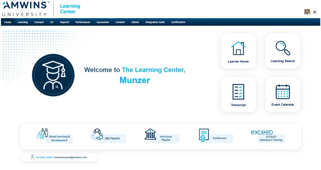
Amwins University runs on Cornerstone. The homepage was the choke point. It looked tired, buried Insurance Playlist and Certificates, skipped EXCEED where people expected it, and leaked traffic before anyone reached search or catalogs.
I owned the revamp end-to-end: L&D interviews, Google Analytics forensics, Figma explorations, and specs a lean IT team could implement, without handing them a science project.
Before · Original Cornerstone homepage.
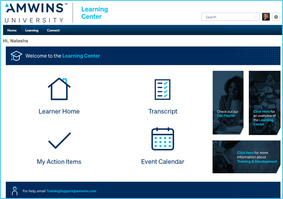
After · Shipped to the full employee base.
Named welcome using Cornerstone-native placeholders; reads personal without scripts.
Learner Home, Search, Transcript, Calendar: the actions analytics said mattered most.
D&I Playlist, Insurance Playlist, Certificates, EXCEED: finally visible in one scan.
Cards replaced the icon soup. Primary jobs moved into a tight grid on the right; long-tail programs slid into a horizontal band underneath so power users could skim without hunting.
The greeting isn't decoration; it signals "this session is yours," which mattered after years of anonymous chrome.
No JavaScript, no custom widgets, no pulled-from-directory headshots in v1. The dynamic avatar idea died here. Static imagery IT could paste in won. Every subsequent sketch got filtered through the same question: can this survive the safelist, and can maintenance stay boring?
Parallel tracks kept momentum: qualitative prioritization with L&D + quantitative proof from Google Analytics. Design lived in Figma until leadership believed the hierarchy; IT reviewed early so implementation stayed pragmatic.
Priority segments climbed 35% on engagement post-launch in Google Analytics, same definitions L&D already trusted. Click-through finally matched traffic: learners weren't leaving empty-handed anymore.
Cornerstone stayed Cornerstone; what changed was the choreography inside the first screen.
A full cutover made the story simple internally, but it blurred attribution. The lift is credible: I lived in those dashboards, but simultaneous platform tweaks mean I can't pretend it was a controlled lab.
If I ran it again, I'd budget political capital up front for A/B infrastructure instead of arguing after the fact.